Magdalene College Library in Cambridge
A new building in an historical context
Architecture: Níall McLaughlin Architects
Client: Magdalene College
Location: Cambridge (GB)
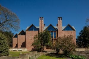
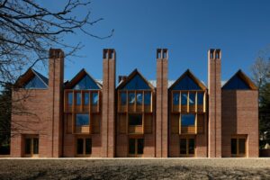
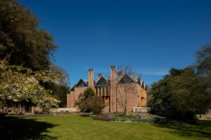
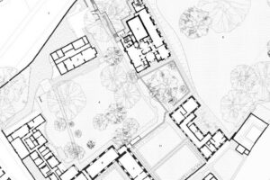
The new building stands almost directly on the west bank of the Cam River, next to the Pepys Library, which was established in the 18th century, and surrounded by two of the extensive green spaces so typical of Cambridge colleges. Níall McLaughlin Architects, a studio that counts among the most experienced when it comes to postsecondary institutions, were tasked with planning the building in 2014 after they had won a design competition.
© Nick Kane
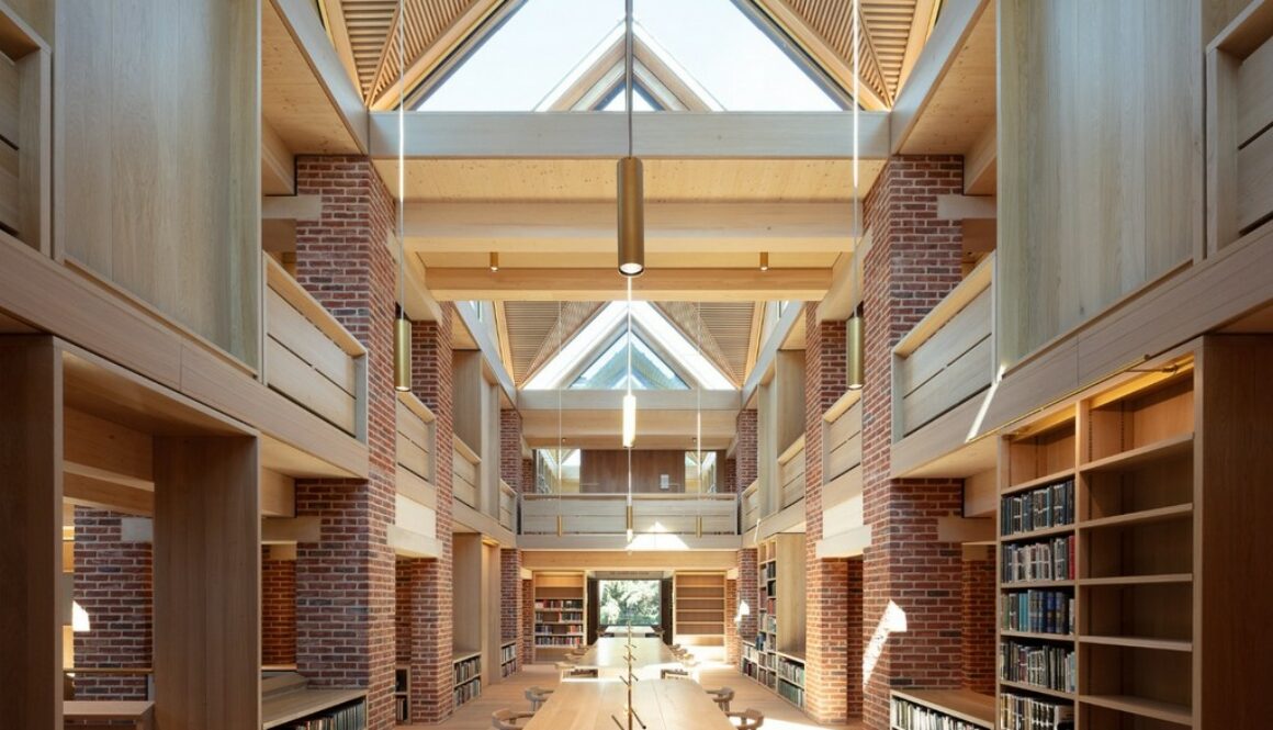
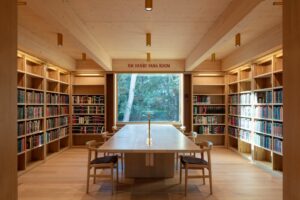
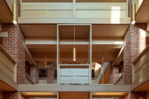
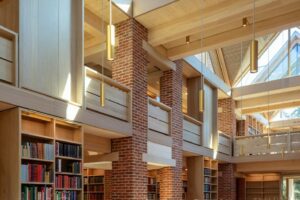
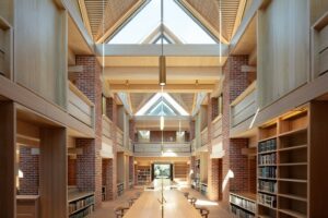
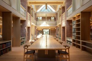
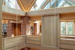
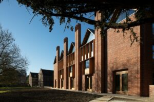
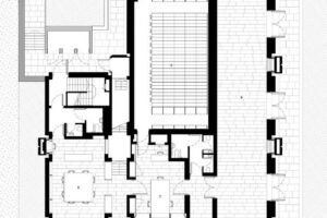
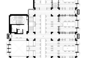
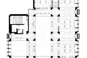
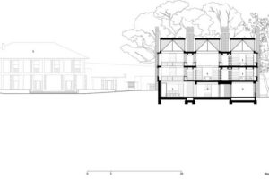
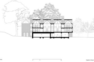
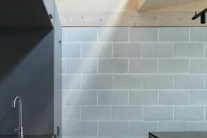
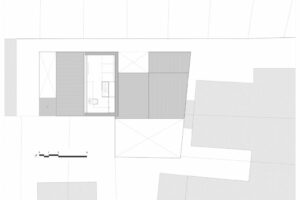
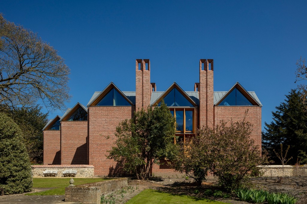
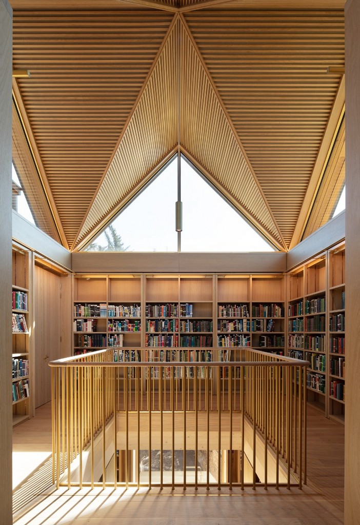
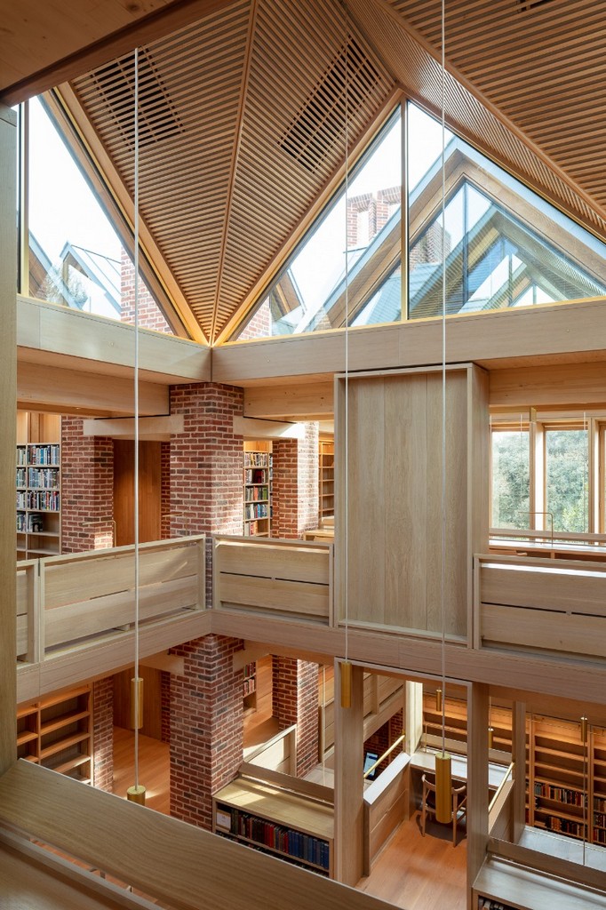
Their design is based on a modular, basic plan of square, load-bearing brick cores that also serve as exhaust chimneys; reading rooms and atria open up between these cores. Above the ground floor, the architects have added a concrete ceiling. In contrast, the ribbed ceiling over the first upper level and the roof surfaces consist of plywood panelling.
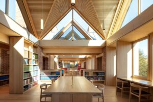
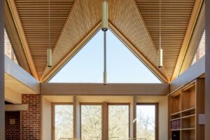
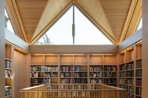
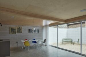
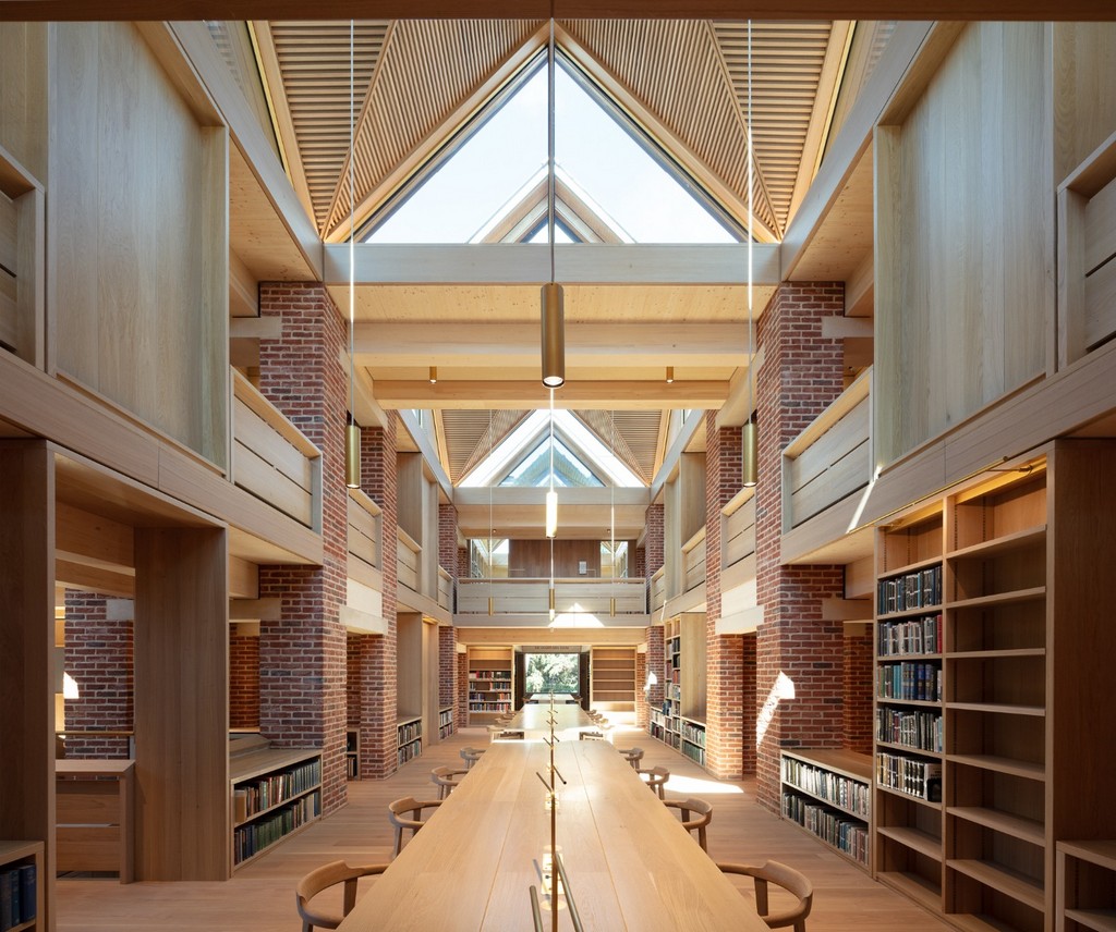
Thanks to glass surfaces that become larger towards the top of the library, the spaces become brighter as visitors ascend. The architects describe their concept: “We wanted to make the building a journey that gradually rose up towards the light. On the way up there would be rooms, galleries and places to perch with a book.”
© Nick Kane
With its hierarchical division into served and servant spaces, the new building evokes associations with the architecture of Louis Kahn, for instance his designs for Richards Medical Laboratories at the University of Pennsylvania and the modest Trenton Bath House in New Jersey.
© Nick Kane
© Nick Kane
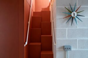
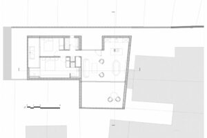
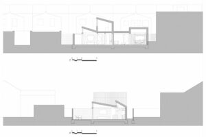
The floor-plan module of the reading room measures 4.7 x 4.7 m: each servant zone with corridors, stairways and bookshelves is 1.3 m wide. Within the square basic grid, the architects have created a great degree of spatial variation. The largest reading room, located on the first upper level, is three modules long; its neighbouring room to the west extends over all three storeys.

© Nick Kane
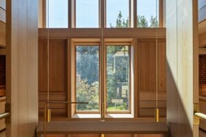
Simplicity and longevity were important planning objectives for the library’s architecture and technical equipment. The exhaust chimneys tower over the gabled roofs in order to generate sufficient lift for the natural ventilation. To facilitate eventual reuse of the handmade bricks, lime mortar was used instead of cement. For the façades, the architects took up elements of the surrounding historical college architecture – such as the oriel-like, protruding reveals that divide the fronts of the upper-level windows. While these window jambs consist of natural stone in their historical models, Níall McLaughlin Architects have made these ones of oak that will take on a stone-grey colour over the course of time.

